photography & cultural studies

essays, exhibitions, publications, articles and papers

click here to return to main page for these papers


SUBLIME SOULS & SYMPHONIES:
Australian PhotoTexts 1926–1966,  Eric Riddler 1993


introduction to this thesis |   table of contents  |   1926-1966 chronology of photo-books

Chapter 1  |   Chapter 2   |   Chapter 3  |   Chapter 4   |    Chapter 5  |   Chapter 6   |   Chapter 7  |   Chapter 8   |    Conclusion


CHAPTER SIX: SYDNEY

6.1 Sydney in general

In 1927 Art in Australia dedicated an issue to images and literature of Sydney. Cazneaux's photographs were advertised as an important feature of the pictorial content.[above]  The Sydney number was advertised as a souvenir as well as an art journal's examination of the culture of the city. Cazneaux's photographs were a departure from the Pictorialist landscape tradition, focussing on city streets and industrial areas. Smog replaced fog as the painterly device.2

Cazneaux's images from the Sydney number of Art in Australia were later divided into two little booklets, accompanied by texts from the same issue which featured, among others, Jean Curlewis. Sydney Streets and Sydney Harbour each followed important themes in Cazneaux's contribution to the original issue.3

A feature on Sydney's beach culture in The Home in 1929, using Cazneaux's photography and Jean Curlewis's writing, was published as Sydney Surfing later that same year. The Sydney Book was part of another series produced in 1931.4


While Cazneaux was the house photographer for Art in Australia Limited, Ure Smith supported other photographers. In 1930 The Home reproduced several images by visiting English-based German photographer Emil Otto Hoppe. Like Cazneaux, Hoppe was a society photographer from the Pictorialist school who had moved on to landscape and travel photography. They were both as interested in modern, urban living as they were in the landscape.

The Sydney photographs in Hoppe's book, The Fifth Continent are dominated by images of Sydney Harbour. An image of Woolloomooloo seen between trees in the Domain was probably featured to prove that there is such a place as Woolloomooloo. A more arresting image shows the Jetties at Circular Quay.(below)

Unlike most photographs of Circular Quay, Hoppe's image does not try to emulate New York Harbor by emphasising the foreshore development. Instead Hoppe deliberately aimed his lens over the Customs House towards the Lands Department clock tower. In doing so he brings the nearest wharves and ferry into prominence. The weathered piles in the foreground lead the viewer to a small boat in the right side of the photograph where a single figure adds human scale to the overall image.

Another visible figure is the classically posed advertisement beneath the Romano's Restaurant sign. Unlike the simply composed landscapes Hoppe took of other harbourside locations, Jetties at CircularQuay is quite cubist in its flat and angular composition.5

Hoppe also contributed to the record the construction of the Sydney Harbour Bridge. Taken just before the top arch was completed, the photograph is rather simple, with the arch framed by clouds and a tree. Hoppe's next image of Sydney is a view of the Conservatorium of Music and Palace Gardens.

The Conservatorium, originally Greenway's stables, occupies the lower half of the picture. It is framed by the parapet of a Macquarie Street building, from which the photograph was taken, and the arc of Farm Cove. Mrs. Macquarie's Point separates the foreground from hazy Port Jackson in the background.


images from E. O. Hoppe's The Fifth Continent:

Woolloomooloo from The Domain Jetties at Circular Quay Sydney Harbour Bridge
Conservatorium of Music & Palace Gardens Royal Agricultural Show Sydney Randwick Park Race Course
Macquarie Street, Sydney Stanley Street, Sydney Sailing on Sydney Habour


The use of open spaces in the images of Macquarie Street is contrasted by the following photograph of Stanley Street, in East Sydney. Rows of terrace houses pile on top of each other on the rise to Darlinghurst, a pattern broken by the occasional tree. There are groups of figures at the bottom of the photograph. Two terrace houses reveal occupation, a pedestrian walks along Stanley Street while a group of four waits in the shade of a side street. This photograph has been retouched in an attempt to conceal the sign on a factory in the centre-left of the photograph. Most of the buildings are late Nineteenth Century terrace buildings but some, especially the two immediately left of the repair shop, reveal an 1840s development, the area being one of the first to be developed with terrace housing in Sydney.6 This image contrasts with Hoppe's images of Australia's open spaces, providing evidence of Australia's urban environment.

Hoppe also includes photographs of urban crowds. As a part of modern city life, crowds did not appear in traditional Pictorialist landscapes, but as urban images appealed to increasing numbers of photographers and Modernism began to evolve, the crowd found a place in modern photography. The Sydney crowds in The Fifth Continent are attending the popular events at the Royal Agricultural Show and Randwick Park Race Course. At the Agricultural Show the crowds are milling around a cafe as show bulls are being led along one of the Showground's street. The view of a crowd from above is a modernistic composition, despite the awkwardly rustic setting of the showground. The Randwick photograph shows the sport loving Australians looking away from the empty track towards a building on the right side of the picture. Presumably they are all assessing the odds.

As the pictorialist haze began to clear from Australian photography, the promotion of Sydney began to reflect the new aesthetics. Max Dupain emerged from the new breed of modernist commercial photographers in the middle of the thirties and was quickly enlisted as one of The Home's major photographers. In 1940 Dupain fulfilled a commission to produced images for Oswald Ziegler's Soul of a City.

The council of the City of Sydney commissioned the book. Soul of a City celebrates the lifestyle of the City. Inspired by the recent sesqui-centenary celebration, for which Oswald Ziegler also provided material, Soul of a City was devised by Ziegler, using Dupain's photography and Douglas Annand's design. The concept of photography reflecting the soul of a city had been raised by Berenice Abbott during the 1930s. The term resembles Byron's description of Rome as a 'city of the soul'.

The 1940 edition of Soul of a City and the fourth, from 1962, are the closest to capturing the soul of Sydney. The first edition presents Sydney's soul as a misty and ethereal phenomenon. The cover, designed, like the rest of the book, by Douglas Annand, features clouds and birds. The photograph shown is a glimpse of the city at night shown through a ring of clouds. The viewer is looking upon the city from up high (the Bridge Pylon lookout to be pedantic), peeping through heavenly mists. The cloud and bird motifs continue into the pictorial content of the book.

A  selection from Soul Of A City 1940 (1st Edition)

for the full set of images of the 1940 edition - click here

The first edition was the only one to use a chronological theme. The accompanying text is a verse about the passage of a day in Sydney, this is quoted throughout the book in relevant sections. Annand adds a sun and moon symbol which appears on most pages to mark the time of day. Pre-empting the international 1980s series of "a day in the life of..." books, the concept adds the rhythm of city life to the book.

Dupain's images begin with misty dawn pictures and continue to midnight. The selection of images shows the city coming to life as the fog lifts, firstly the working class such the street cleaners and the grocers, then the middle class commuters and finally the women shoppers. After the recreational pictures of afternoon come the images of Sydney nightlife, theatre, cinema, skating, Luna Park, etc.

Amidst the revelry, the fact that the book was prepared at the beginning of the Second World War is barely covered, only through a reassuring caption for a photograph of a military parade does the reader get any indication of the world political situation's place in the mind of the city.

The next edition of Soul of a City was published about 1950. This time there was a stronger emphasis on the history of the city, including the use of old paintings as background for the modem photographs in the layout designed by Gert Sellheim. The photographs came from Dupain, Hal Missingham and press photographers, denying the book the unity of the first edition.

A selection from Soul Of A City 1949 (2nd Edition)


The photographs in the second edition were more involved in the promotion of the city's landmarks like Hyde Park and the Town Hall than the lifestyle of the people. This was somewhat remedied in the third version of Soul of a City, published in 1953. This time there was no inclusion of any photographer in the credits although it would seem that Dupain's images were once more the basis for the book. The photographs were layed out by Gert Sellheim in chapters according to their subject, like yachting or the Harbour Bridge.


a Selection from Soul Of A City 1953 (3rd Edition)


Ure Smith's Portrait of Sydney from 1950 seems to have served as the model for its content. The endpapers feature a brief poem by John Thompson which was expanded into the basis for the fourth and final Soul of a City in 1962.

The 1962 version of Soul of a City saw Dupain back as principal, albeit not exclusive, photographer. Ziegler himself took control of the design of the book, with Stan Ostoja-Kotkowski designing the cover and endpapers.

There was also a return to images of Sydney's lifestyle. In 1962 the night life was full of teenagers at the movies and dancing for a television music show (possibly 6 O'clock Rock). And perhaps because of Frank Packer's Australian Consolidated Press's involvement in supplying photographs for the book, the harbour was the home port for Gretel, Packer's new yacht and Australia's first America's Cup challenger. Dupain's interest in historic architecture was also showcased in this book, Thompson's accompanying poem alluded to the role of history in the making of Sydney's soul.

Largely absent from all four editions of Soul of a City is the area outside the municipal limits. While the City Council is justified in wanting the books it commissions to promote its own operations, the dearth of suburban detail is notable by its absence. Sydney is, after all, a very suburban city and images of Bondi, Manly and North Sydney do not address this.

a selection from Soul Of A City 1962 (4th Edition)


Another book on Sydney which was produced in more than one version was Frank Hurley's Sydney, A Camera Study. Published In 1948 it was the first of Frank Hurley's Camera Study series. It began with a series of colour photographs of the coastline and harbourside, interspersed with wildflowers, fire engines and the like.7

Hurley's series of photographs reveal several important interests. He used a lot of aerial photography. His aerial photography became so popular that in 1952 a separate volume was produced of Sydney from the Sky, A Camera Study.8

from Sydney from The Sky, Frank Hurley


Other interests are sailing on the harbour, Gothic architecture and the beach. Hurley's interest in Gothic architecture is more dramatic than E. O. Hoppe's interest in church architecture. Hurley incorporates the Sydney Town Hall and the Great Hall of The University of Sydney into the series. Other, more Classical, buildings get similar attention, notably the Mitchell Library and the Art Gallery. Hurley's images of Gothic interiors can be compared to his landscapes where the dramatic landform's and plant life are enhanced by backgrounds of cloud formations which are both natural (taken with a filter) and montaged from stock negatives which Hurley kept.

a selection from Sydney A Camera Study, Frank Hurley

Sydney Town Hall, Frank Hurley Grand Organ Sydney Town Hall, Frank Hurley State Library entrance, Frank Hurley

NSW Art Gallery, Frank Hurley

     
St Patrick's Sydne, Frank Hurleyy St Mary's, Chapel of Our Lady, Frank Hurley Sydney harbour entrance, Frank Hurley


Sam Ure Smith produced Portrait of Sydney in 1950, using a series of Rob Hillier's photographs as well as a selection from other important photographers. They included Hal Missingham, director of the (then) National Art Gallery of New South Wales, Max Dupain and a new photographer, David Moore. Portrait of Sydney, is arranged in a way that emphasises particular aspects of Sydney, in short photographic chapters which are buoyed by a lengthy anecdotal introduction by Kenneth Slessor. The Sydney Harbour Bridge, Kings Cross, the harbour, the Domain and other places are shown, illustrating the most attractive features of Sydney.

Besides the landmarks listed above there are sections on the various parts of the business district. Martin Place is shown in its capacity as a Banking and Insurance centre with its canyon of tall buildings as well as its position as a civic focal point with the Cenotaph and General Post Office.[figure 39] Nearby, is Wynyard Park, once an old parade ground in Sydney's back streets, is shown as a small open space amongst the York Street skyscrapers lined with crowds of petrol ration era commuters queuing for camouflaged buses (which appear in a Max Dupain photograph which evidently dates from about 1945).9 The unseen but captioned presence of Wynyard Station adds to the park's importance.

While the business district of Sydney continued to promote its own Manhattan-style modernity, suburban Sydney was modernising in a more conservative way, which none the less still bore an American influence. Suburbs began to develop around the private car with access to local amenities and employment. Suburban shopping centres were growing into business districts with their own department stores, office blocks and industrial areas. The average suburban resident's dependence the centre of Sydney diminished during the mid fifties. Sydney's oldest suburban region was Parramatta which, with Chatswood and Bondi Junction, led the way in urban decentralisation.

a selection from Ure Smith's Portrait of Sydney 1950


In 1955 Oswald Ziegler produced Parramatta Pageant. It was part of his move away from mainly pictorial to illustrated history books. Amidst the historical images and a large section on local industries are images of a suburban centre on the verge of major expansion. The shopping centre is accommodated in both ground level and aerial photographs. Hurley's aerial image shows how large the business district was, and how it was dominated by cinemas and silos. Other images take advantage of the city's modernity, electric trains, factories and modern housing.

The surrounding landscape is featured, much of it protected by parkland reserves. Several images, however, show the Dundas Valley as a nearby rural oasis, despite the streets of the Housing Commission subdivision of the valley being incorporated on the accompanying map. Unlike the centre of Sydney, where open space is relatively, albeit not totally, permanent, Parramatta's open space was then being stripped of its trees and its protected Green Belt status under the ever-weakening County of Cumberland plan of 1948.

a selection from Oswald Ziegler's 1950 Parramatta Pageant:


Another Sydney region to be covered by Ziegler was Kings Cross, in Life at The Cross, published a decade later. In a contrast to Parramatta's ambitions as a suburban centre, Kings Cross was promoted for its "Bohemian" lifestyle.

a selection from Oswald Ziegler's 1965 Life At The Cross:


The last word on Sydney goes to Quinton Davis and Gavin Souters' Sydney, a project in interpretation published in 1965. Souter was a journalist with the Sydney Morning Herald, and was able to cover the city as an experienced observer. With Davis's photographs, the book explores its legendary characters; such as Bea Miles and "Eternity", the suburbs, rich and poor, and the rapidly growing business district

From the start Souter disavows any intention to produced a book of solid facts, compressing details such as population and area into a tiny foreword before embarking on his anecdotal text about people and places, inspired by his life as a reporter. The stories are accompanied by aerial photographs of the suburban sprawl and close up pictures of garden comers. Only Slessor's writings for Portrait of Sydney and Life at The Cross could match Souter's experience and Slessor was limited to Kings Cross for much of his material. Souter and Davis were much wider ranging.

Sydney, in its phototext manifestation, comes across as a city based on its people and their lifestyle. From the 'innocent' days of early beach culture to the heady 1960s, it is usually the citizen, rather than the landmark, who dominates the image. As far as the city's buildings go, they are shown as Sydney's progress or heritage, a backdrop to the play below.

a selection from Quinton Davis and Gavin Souters' 1965 Sydney

Left: Bea Miles

Below Left: Pool Jump

Below Right: Maroubra Beach

Bottom: Hornsby via Srathfield rail line


      1. When Art in Australia Limited published a similar book on the subject of Melbourne the following year they used such respected figures in Pictorialism as John Kauffmann and J. W. Eaton to portray the City.
      2. This was a development from the city scenes follwing the pictorialist style exhibited at the Sydney based Australian Salons of Photography in 1924 and 1926. Cazneaux had exhibited in both Salons.
      3. Another theme in the Sydney number of Art in Australia was the construction work around the Sydney Harbour Bridge. Ure Smith would later employ Cazneaux to photograph the Bridge's progress in The Bridge Book and The Second Bridge Book in the early 1930s.
      4. The Sydney Book used new photographs but the text was the same as that used in the Sydney Number of Art in Australia, by Jean Curlewis, who had died in 1930.
      5. Other photographic books contain images compared to cubism, viz Jack Cato's Melbourne and Rob Hillier's Portrait of Melbourne.
      6. The buildings conform to early fire regualtions with their high parapets and deep set windows, see J. M. Freeland, Architecture In Australia, F. W. Cheshire, 1969.
      7. Because Sydney, A Camera Study served as a de facto New South Wales, A Camera Study, the breadth of coverage far exceded the limits of the city itself. Wollongong, Mount Kosciusko, The Jenolan Caves and Newcastle are all featured. By 1958, when a totally revised edition was produced, the presence of New South Wales in Australia, A Camera Study allowed the coverage to be brought back to within Gosford and Moss Vale, with a clearer reference to these outlying centres as retreats from the city itself.
      8. Aerial photography in Sydney was in vogue during the early fifties, the Fairfax newspaper group often used aerial photography in the supplements at the time, someimes using Hurley's work.
      9. If one follows the final chapter of Dymphna Cusack and Florence James' 1951 novel Come in Spinner, it can be seen that Martin Place and Wynyard Square were linked in terms of pedestrian movement.


6.2 Strength-Beauty-Simplicity: The Sydney Harbour Bridge

Something, I suppose, must be said about the Harbour Bridge. It elbows itself into any description of Sydney as truculently as it forces its presence on the city. The Bridge is 20 miles high, weighs 736,000 Persian yakmans (which is roughly equivalent to 24,000,000 Turkish yusdrums), is 142 miles, 17 rods, 23 poles, 5 perches in length, carries everything from rickshaws to electric buggies, and feeds on paint.

These, as I think I remember them, are the exact figures, or near enough to give an impression of its size, which increases rapidly as you approach it. It has been called a Titan's coathanger, a circumflex accent over the song of a metropolis, and even likened by the poet Hugh McCrae to his mistress's eyebrow.1

Thus spake Kenneth Slessor in 1950. Prior to the construction of The Sydney Opera House there was one thing, one icon, that was used as the identifying image of Sydney more than any other. The Sydney Harbour Bridge.

Like Melbourne's Manchester Unity Building, artists and photographers were aiming their sights at its location long before it appeared, but its arrival redefined the space between Dawe's Point and Milson's Point.

In the context of the Harbour Bridge's presence in photographic books on Sydney, the reaction of the contributor ranges from Hurley's captions which were either matter-of-fact (listing the dimensions and statistics) or glamourous (Symphony in Steel was a title used at least twice) in the various Camera Studies to Kenneth Slessor's sarcasm (quoted above) in Portrait of Sydney.The Bridge, as Slessor suggests, was subject to much exaggeration in its appreciation. Even serious guide books could not resist anecdotes about the strength of Sydney's strongest gale, the riveter who survived a fall, the night that lightning struck a pylon.3

Even before the Bridge was completed Art in Australia Limited was paying it due attention. The 1927 Sydney number of Art in Australia had featured photographs, drawings and paintings, not only of early work on the Bridge itself but of the lost landmarks in its path: Prince's Street, Dawe's Point and the elegant Milson's Point ferry wharf. The Home occasionally featured the Bridge's construction in its photographic section.

double page spread from Art in Australia 1927 Sydney Number


In 1930 and 1931, using images which had appeared in The Home as a starting point, Art in Australia Limited produced two Bridge Books, with Cazneaux as principal photographer.4 Cazneaux continued his departure from the pictorialist landscape with photographs of the works and arch. This was not to say that there was no attempt on Cazneaux's part to incorporate ethereal images of the Bridge.

One photograph in The Bridge Book likens the Bridge to a rainbow (the arch had just joined at the time). Many photographs exploit the form of the incomplete arch and its support cables. The cables themselves are portrayed in a pictorialist fashion in the photographs Cable Silhouette and Taking The Strain. The extent to which they can be classed as pictorialist images is limited by the tight framing and stark composition. Besides the ethereality of the focus, the cables are very different to the placid landscapes of true pictorialism.

3 images above from The Bridge Book 1930 Hoppe image above from The Second Bridge Book 1931


The Second Bridge Book includes a selection of images taken by visiting European pictorialist E. O. Hoppe, such as Feet Across The Sea, showing workmen paving the pedestrian footway.(above right)

This image, taken after Hoppe had begun to move away from pictorialist aesthetics, shows two workers apparently painting the fence of the eastern pedestrian walkway. The walkway recedes from view as it sweeps off towards the right. To the left of the vanishing point lies the city skyline, still limited by the 150 foot height limit imposed on buildings at the turn of the century. The city is a narrow band above the triangle of Sydney Cove that links the Bridge to its destination.5

On its completion Ure Smith published Sydney Bridge Celebrations. Along with local photographers in the main text, E. O. Hoppe provided a photographic series of Sydney landscapes. The book was a celebration of Sydney's culture as much as it was a celebration of the Bridge. Despite its purpose, there are few interesting photographs of the Bridge.


for more on the 1932 Sydney Bridge Celebarion book - click here


Frank Hurley was another admirer of the Bridge. Like many of Sydney's artists and photographers of his time the construction of the Bridge caught his attention. He made a film about its construction using his favourite title, Symphony in Steel. The various editions of Sydney, a Camera Study feature sections devoted to the Bridge. He also included the Bridge in Sydney From the Sky, a Camera Study and Australia, a Camera Study.

Hurley's long-term interest in the Bridge resulted in an interesting record of its changing role in Sydney's traffic pattern. In the first edition of Australia, a Camera Study Hurley used a photograph, taken about 1950, of the Bridge's deck taken from the north western pylon. The photograph was replaced in the 1961 edition of Australia, a Camera Study by a more recent photograph of the same scene.

Sydney Harbour Bridge, Frank Hurley 1948 Sydney Harbour Bridge, Frank Hurley 1961


The earlier image shows a city with a low, hazy horizon while the later image is clear and high-set. Both photographs, as can be judged by the shadows, were taken at the same time in the morning. Because of this it is obvious that during the 1950s the Bridge's traffic patterns had changed. Allowing for the replacement of the former tramway reserve with the southbound Cahill Expressway approaches during 1958, there is still a noticeable reduction in southbound traffic. The northbound lanes, all but empty in the earlier photograph, show the increased traffic brought on by the development of North Sydney as a sister business district for Sydney.

Always an intended consequence of the Bridge's construction, the Depression and Second World War delayed North Sydney's ascendancy but the massive M. L. C. Headquarters of 1957 heralded the beginning. The Bridge had fulfilled the ideal of being a link rather than an arterial feeder. These images of the Bridge were popular enough to be used on the covers of road-related publications. The June 1952 issue of the Department of Main Roads' house journal Main Roads and the 1962 edition of Robinson's Street Directory of Sydney use each photograph respectively.7


Many of Hurley's bridge photographs are taken from a low viewpoint to increase the impact of the Bridge's size, as Slessor had lampooned. The arch of the Bridge is sometimes framed by another curve, such as that of the northern approach or one of the pavilions in Bradfield Park.(above)
Hurley's interest in aerial photography was also the means of obtaining a striking view of the Bridge in Sydney from the Sky, a Camera Study, 1952. (above)

Although Max Dupain has taken notable photographs of the Sydney Harbour Bridge, his work as featured in Soul of a City and Portrait of Sydney pays little attention to it.8 In most cases it is reduced to a part of the city's approaches. Like Hurley, Dupain used the Bridge as a backdrop to scenes of Circular Quay. In Portrait of Sydney, two similar Dupain images appear, one on the cover, the other on the page devoted to the Bridge.[figure 56] Taken from the north east pylon, the photograph looks towards Sydney Cove, with the arch of the Bridge making a dramatic right margin.

The caption writers for Soul of a City, especially the 1949 edition, were as lavish in their praise as Hurley's writer. A simple image of the Bridge taken from Observatory Hill bears the caption "Nature's handiwork and the artifice of man, each the perfect complement of a majestic whole".9

As a ferry passenger, I frequented Circular Quay regularly.
In those days I carried a camera all the time and this picture was seized on my way to work.10

Photographs of the Bridge can be compared to the contemporary painters' interpretations. The Sydney Modernist painters were attracted by the design of the Bridge, especially during its construction. Roland Wakelin, Dorrit Black and Grace Cossington Smith made important modernist paintings based on the emergent span. The latter's work is of particular interest. Her The Curve of the Bridge, painted circa 1928, is almost identical to a photograph by Harold Cazneaux, The Sweep of the Bridge, first published in The Home in late 1928, then in The Bridge Book in 1930.11

Painters were often reflecting the appeal of the Bridge to their own communities. For Cossington Smith, like Cazneaux, the Bridge was the link between her North Shore home and the Metropolis. For an Eastern Suburbs painter like John D. Moore, it was another part of his harbour view. The poetic view of the Bridge is also interesting. At the start of the chapter we had Slessor's view, including a reference to Hugh McCrae. In the Harold Cazneaux and Jean Curlewis collaboration, Sydney Harbour, Curlewis's poem A City features the rather phallocentric lines "Building a bridge in the sea city. Thrust of girders, web of girders over the sea."12

The modernity of the Bridge was a welcome opportunity for modem artists, in all media, to express their aesthetic ambitions with a suitably contemporary subject. Besides its modernity the Bridge came to be seen as a symbol of the British Empire, being a collaboration between a British company and Australian labour at a time when the Depression was weakening the bonds of Empire.

This is part of the reason why De Groot, a representative of the conservative New Guard movement, made his notorious dash to cut the ribbon before Labor premier Jack Lang could do so. When the post war Immigration Scheme came into effect the Bridge figured in many images of Sydney Harbour, perhaps to create an antipodean version of New York's Statue of Liberty. When something as large and prominent as the Sydney Harbour Bridge appears on a city's doorstep, it is inevitable that its presence will be felt by most of the citizens and it therefore comes to mean many different things to different people.

  1. Kenneth Slessor, in Sam Ure Smith and Gwen Morton Spencer, Portrait of Sydney, Ure Smith, Sydney, c. 1950.
  2. ibid and Frank Hurley, Sydney, a Camera Study, Angus and Robertson, Sydney, 1948, fully revised, 1958.
  3. Gregory's Guide to Sydney, 17th edition, c.1953, Pp 27-34.
  4. The Bridge Book and The Second Bridge Book, Art in Australia Limited, 1930 and 1931 respectively'. Cazneaux continued to take photographs of the Bridge after its completion. The most famous of these, Arch of Steel, 1935. appears in Oswald L. Ziegler's Australian Photography 1947,
  5. Ziegler-Gotham, Sydney, 1948.
  6. Hoppe had been to Australia to prepare the images for his book The Fifth Continent during 1930. At the time of his visit his photography was shown in the David Jones emporium in Sydney and in the pages of The Home. One of the photographs shown in The Home depicted New York with its Sydney Harbour Bridge lookalike, the Hell Gate Bridge, on the horizon.
    Art in Australia Limited, Sydney Bridge Celebrations, Art in Australia Limited, Sydney, 1932.
  7. The earlier photograph was also used in the 1958 edition of Sydney, a Camera Study. The New South Wales Department of Main Roads, Main Roads, Sydney, June 1952 and Robinson's Street Directory of Sydney, 22nd edition, H. E. C. Robinson, Sydney, 1962.
  8. Soul of a City, Oswald Ziegler, Sydney, 1940, 1949, 1953 and 1962, Portrait of Sydney, Ure Smith, Sydney, 1950.
  9. Oswald L. Ziegler, Soul of a City, 1949.
  10. Max Dupain, Max Dupain's Australia, Viking, Melbourne, 1986.
  11. Grace Cossington Smith's The Curve of the Bridge was first reproduced as Tlu; Bridge Curve in Art in Australia, Series 3, Number 29, September 1929, plate 26. It lias been recently reproduced in Art and Australia, Volume 29, Number 1, Spring 1991, Pp 1 and 39. Cazneaux's The Sweep of the Bridge was first published in The Home, September 1, 1928, p 38, see also, The Bridge Book, 1930. For other images of the Bridge see Ursula Prunster, The Sydney Harbour Bridge 1932-1982, A Golden Anniversary Celebration, Angus and Robertson and the Art Gallery of New South Wales, 1982.
  12. Harold Cazneaux and Jean Curlewis, Sydney Harbour, 1928.
    The poem had previously appeared in the Sydney Number of Art in Australia, Series III, Number 20, June 1927, p 17.

6.3 Life on a harbour wave; Sydney at leisure

Two of the collaborations between Harold Cazneaux and the poet Jean Curlewis, Sydney Harbour and Sydney Surfing, were designed to promote Sydney's aquatic lifestyle. Sydney's reliance on Port Jackson for trade and (at the time) migration was matched by the city's affection for its major natural landmark.

Sydney Harbour was a small folder with five Cazneaux photographs and a poem, A City, by Curlewis, which had originally appeared in the Sydney number of Art in Australia. Cazneaux's images are of ferries, bays and dockyards.

A City deals with the relationship between shipping and Sydney's economic prosperity. The opening stanza reads,

Sun and dust. Sun and dust. A city of sun and dust, built by the sea. Sea and ships. A city of ships, sea and ships in the streets of her. Ships and shops. Masts of ships over the shops, funnels of ships behind the shops. Silks in the ships' holds, silks in the shops. Silks in the shops, toys in the shops, jewels in the shops, cakes in the shops, flowers.2

Sydney Surfing is a much larger book. Unlike Sydney Harbour, a small selection from Art in Australia, Sydney Surfing was based on a rather substantial feature from The Home. There are many photographs of sun bathers and surfers, accompanied by an essay. Curlewis makes several observations on Sydney's beach culture, reflected by Cazneaux's imagery.Discussing the stereotype of the Australian surfer as "young Greek gods" and "bronze statues," she observes,

...the surf is a sculptor. Those tons of breakers fall like mallet blows and swimmers are chiselled slim and straight. The foam, fizzing and stinging like iced champagne, restores to slack fibres the priceless quality that doctors call "tone". The sun polishes the skin to an incredible smoothness. Until the Australian surfer looks like-I cannot help it-a young Greek god.3

Such romanticism of the bronzed surfer is matched by Cazneaux's images of male surfers. Women take a more decorative than heroic role. On the growing fashion in colourful and decorative bathing suits she writes,

No one has called Australia an artistic country. But no one can deny that nowadays it has a nice-a very nice-taste in bathing suits. I cannot imagine that anywhere in the world is there such a bursting bomb, a flower bed, a living carpet, a ballet, a kaleidoscope of colour as there is this year at Coogee or Bondi...the designers are making brilliant rubber butterflies and blossoms for girl bathers to wear poised on their shoulders, and caps, and wrists. "Flowers in the ocean", say the conservatives. "How incongruous!"

But it is always the incongruous that gives the kick to the cocktail.4

Such lines reveal the nature of 'The Roaring Twenties'. Even with the sepia monochrome images, the lifestyle is depicted as colourful. One image, corresponding with Curlewis's description of colourful bathing costumes, is titled 'Hundreds and Thousands'. Curlewis concludes her essay with a wry comment on those traditional enemies of beach culture...

England's patron saint rescued a maiden from a dragon. Australia's patron saint will certainly be the man who finally rescues her national sport from a shark. With perhaps a minor, but still honoured, niche for the man who exterminates the bluebottle.5

The accompanying photographs show the sunbathing and surfing culture. There are images of groups entertaining themselves into a stupor, people hiding in the shaded pavilions and bodysurfers. In E. O. Hoppe's The Fifth Continent there is a similar, apparently posed, photograph of four women with a beach ball.

Even in black and white it is obvious that the costumes are colourful, as described by Curlewis. As Sydney's beach culture developed in the Twentieth Century the bronzed surfer and bathing beauty became part of the city's promotional background.

Sydney's lifestyle was incorporated into Ziegler's 1938 New South Welsh promotion Romance in Paradise.

With its R.K.O.ish title and platinum blonde cover girl, Romance in Paradise suggests a glamourous adventure tale. Rather than that it is a simple record of a holiday around New South Wales, probably fictional but possibly based on Ziegler or a contributors' experience.

Romance in Paradise is sub-titled A Modern Pictorial Journal of Australia's Most Glorious Scenery.

A good deal of the imagery in Romance in Paradise is of sylvan countryside, a contrast to the beaches that usually dominate the state's publicity. Water sports are featured. Yachting on Sydney Harbour and rowing on Lake Parramatta are included in the imagery.

The depiction of a holiday in isolation, whether based on true experiences or not, is a result of the motor car's influence. Most, if not all, of the holiday resorts featured would have been accessible by road in the immediately post-depression era.

The resemblance borne by Romance in Paradise to glamourous magazines and Hollywood movie posters reveals the commercial intent behind this and all of Ziegler's output.

Romance in Paradise promises the romantic holidays made possible by the solitude of the motor car.


A specific book about Sydney leisure was the eighth volume of the Ure Smith Miniatures. Produced in 1950, Sydney Beaches, a Camera Study (not to be confused with Hurley's Camera Study series) celebrates the city's beach culture with a historical essay by surfer and sports writer Lou d'Alpuget and a series of photographs.

It takes up the ideas of Sydney's Beach Culture from the Sydney Beaches book of 1929. One of Cazneaux's photographs of body surfers appears in each book.
Most of the contributing photographers were also featured in Ure Smith's Portrait of Sydney from the same time. D'Apulget also authored Let's Go Sailing, the ninth Ure Smith Miniature, with a diversity of yachting photographs.

Frank Hurley's Sydney, a Camera Study, 1948, also carries a plethora of boating photographs.(See bottom of page)

The involvement of many Sydney photographers in aquatic sports, such as the Dupain family's rowing, made the temptation for Sydney promotions to showcase its recreational waterways irresistible.

Sydney Beaches, a Camera Study shows the new surf riding culture as well as scenic beach landscapes, broadening the outlook of Sydney Beaches, which examined the youthful sunbathers and body surfers as the essence of Beach Culture.

Below a selection from Ure Smith's 1950 Sydney Beaches        (for the whole set - click here)

 
below page from Frank Hurley's 1948 Sydney A Camera Study


  1. Harold Cazneaux and Jean Curlewis, Sydney Harbour and Sydney Surfing, Art in Australia, Sydney, 1928 and 1929 respectively.
  2. Sydney Harbour (ibid) n.p.
  3. Cazneaux and Curlewis, Sydney Surfing, 1929, n.p.
  4. ibid.
  5. 5. ibid.

6.4 Antipodean Bohemianism

In 1897 the City Council bestowed the name Queen's Cross on the junction of William Street, Darlinghurst Road, Victoria Street and Bayswater Road, and eight years later it removed any confusion with Queen's Square by changing the Cross's sex. Sex has always been somewhat equivocal at the Cross.1

Kings Cross makes its first appearance innocently enough in 1928 in the Art in Australia Ltd booklet Sydney Streets, itself taken from the 1927 Sydney number of Art in Australia. It appears as the point of view in a photograph of William Street, looking down the hill towards the city centre. (below left)


In The Sydney Book of 1931 Kings Cross appears in an aeriai photograph taken by The Sydney Morning Herald.(above)
Neither photograph is particularly concerned with The Cross itself, it is an incidental feature.

The first Soul of a City shows a few images of Kings Cross, mainly images of the tree-lined Darhnghurst Road. There is also a picture of the new Minerva Theatre in the night life section. The most famous image is of evening peak traffic crowding The Cross on a rainy day. Another photograph from this vantage point has been widely reproduced in recent times. Once again The Cross is an incidental location.

Pages above from Soul Of A City 1940
 
Pages below from Portrait of Sydney , Ure Smith


Portrait of Sydney devotes a double page spread to The Cross.(above)   Kings Cross, being home to the book's narrator Kenneth Slessor, is given its first real chance to express its local colour in such a promotional effort. This was the start of the romanticism of The Cross, with a view to its tourist value. In words that echoed his poem, William Street, Slessor wrote...

King's Cross, indeed, is not Sydney. It is Sydney seen through the eyes of lonely and homesick aliens, the colonies of displaced Poles and Jews and Hungarians and the itinerant clusters of Americans...

Its plan of living represents a cut across the organic structure of the Sydney ant-heap. Hovels are wedged between palaces. Millionaires look out of their "luxury apartments", their silver and velvet suites, at the slum-world looking at them from the tenement next door or across the street. Among the termites of the yelling flat-blocks, ladies of unimpeachable virtue lend aspirin to ladies who come home barefoot with hiccoughs.

The most orthodox burghers live door-to-door with baccarat-hells. Police patrol-vans are parked between spirit merchants' delivery-wagons and Bentley cars. Cheeks blush at jowls as they squeeze together in the most thickly populated, and certainly the most noisily infested, square mile of the metropolis.

Here the lion lies down with the lamb, the serpent with the dove, the wolf with the chicken, layer over layer of human life in every manifestation of good and evil, riches and poverty.2

Unfortunately the selection of photographs fails to live up to Slessor's experience. The caption to an ordinary image of Darlinghurst Road explains that it "is the parade-ground of the Cross, dappled with shadows, crowded with shoppers and shoplifters, magnates and dowagers, artists in velvet coats, ladies in pyjamas, spivs, dips and miscellaneous Bodgies." If it weren't for the dappling of shadows, the viewer would be most disappointed.

Despite occasional two page forays into Sydney and Melbournes' Bohemia, for most of the Twentieth Century the nation's promoters were at pains to show the wholesome side to Australian life. By 1965 the 'Permissive Society' had emerged and Kings Cross in Sydney became the subject of its own book.

Life at The Cross was produced by Oswald Ziegler Publications in collaboration with Rigby. The photography was by Robert Walker and the text was written by long-term resident poet Kenneth Slessor. Slessor's accompanying text was his second contribution to such photographic studies, after Portrait of Sydney in 1950. As a long term resident of Kings Cross, Slessor could cast a cynical eye upon the outsiders' opinion of the area. Life at The Cross, in both Slessor's text and Walker's photographs, does not shy away from a good, tourist-dollar-making myth.

The Kings Cross of 1965 was, according to the book, a comfortable Bohemia. The gangster era of the Roaring Twenties and early Depression is hardly mentioned. Since the spread of non-English speaking people to the general suburbia of Australia, The Cross's reputation as an enclave of migrants had lost a lot of its exoticism. The Cross could not, however, lose its eroticism. The nightlife is the major factor in the book's examination of tourism in the area. The culture of drugs and prostitution is ignored in favour of the ostentatious strip-clubs. The Cross as depicted is The Cross of legend and characters rather than The Cross of bad reputation.

Selection from Life at the Cross


Kings Cross is shown to be home to the arts, U.S. Sailors on R&R, vibrant youth and lost youth. To the west is crumbling working class Woolloomooloo, to the East the luxury apartments and old mansions of Elizabeth Bay.] The bohemian life of The Cross is wholesome fun, not sleazy or struggling. The Wayside Chapel is dealt with optimistically, a sort of Beat Cafe with a chapel on the side.

Robert Walker has said that he wanted the images in Life at The Cross to have been in morning through to midnight order in the style of the original Soul of a City. Ziegler had other ideas, wanting to show the cosmopolitan style of the area rather than the passage of time. Also like Soul of a City, Life at The Cross was taken on a part-time basis, away from Walker's studio practice.

Walker was also apprehensive about photographing people in the street, an integral part of Life at The Cross. The book is full of studies of people on the streets, including several serial images including an art student's morning and a little girl's ordeal at a hairdresser's.

Far below... Kings Cross was a diadem of multi-coloured jewels and the harbour was black velvet spanned by the arch of the bridge which was floodlit at night and glowed a pale, unearthly green topped by a winking, red signal light.4

Even the pulp literature of the time was impressed by the lightshow at Kings Cross. The cover, the only colour image in the book, a blurred time exposure of William Street, is abstracted further by being printed sideways. The bright lights of The Cross served to indicate its red-light nature, especially the ubiquitous Coca Cola sign at the top of William Street.

Walker goes much further into the association of sex and Kings Cross than previous books. It was the mid sixties and sex was selling, if the copies of Sex and the Single Girl for sale in one of Walker's photographs are any indication. He illustrates Slessor's description of strip tease acts to their near-naked conclusion. Walker also observes girls with sailors and, in a photograph of a dark bar, men with sailors.

Kings Cross is part of Sydney's mythology more than it is part of its geography. Ziegler, through Slessor and Walker, was selling this mythology. It never-the-less managed to delight a local audience, judging by Nancy Keesing's review in The Bulletin in December 1964. One of Life at The Cross's virtues, she wrote, was "that it so well conveys the spirit of a really quite inexplicable region which, paradoxically, for each successive generation, seems to become younger as it grows older."5


  1. Gavin Souter, Sydney, Angus and Robertson, 1965.
  2. Kenneth Slessor, Portrait of Sydney, Ure Smith, 1950. The line "King's Cross, indeed, is not Sydney" echoes the argument that New York is not America.
  3. caption in ibid.
  4. Marsha Wayne, King's Cross Affair, Horwitz, Sydney, 1965, p 103.
  5. Nancy Keesing, "Slessor at the Cross" Tlie Bulletin, December 4, 1965. A less enthusiastic reviewer was Brian McArdle in Walkabout, April 1966.

n.b. Kings Cross is usually spelt without the apostrophe. In cases where 1 am quoting from a source which refers to King's Cross, I have kept it in that form.


NEXT >>>  Chapter 7

Introduction to this thesis |   table of contents  |   1926-1966 chronology of photo-books

Chapter 1  |   Chapter 2   |   Chapter 3  |   Chapter 4   |    Chapter 5  |   Chapter 6   |   Chapter 7  |   Chapter 8   |    Conclusion


Based on the original thesis submitted as part of the requirement of the Masters of Arts - University of Sydney.
This is the 2021 online verson of Eric Riddler's 1993 thesis.
For this 2021 version extra images and links have been added to the text that align with photographs/topics being mentioned.


contacts - copyright notice - sharing information - permissions - other stuff

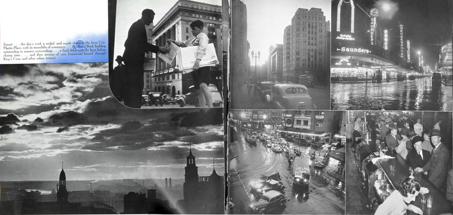
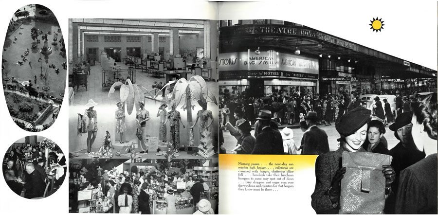
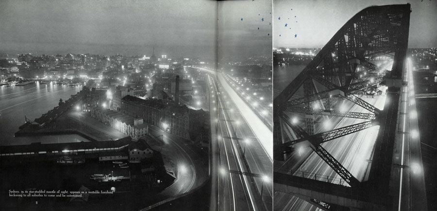
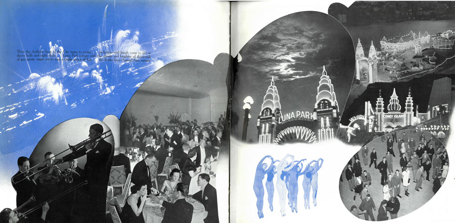
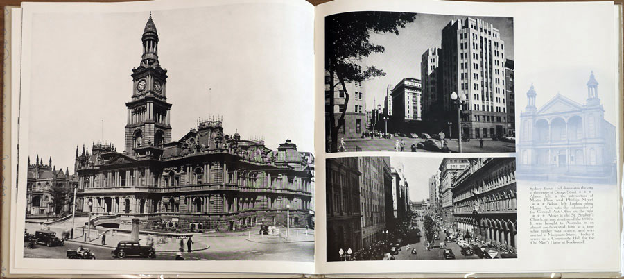
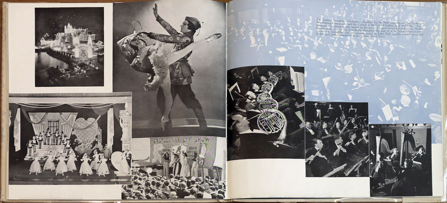
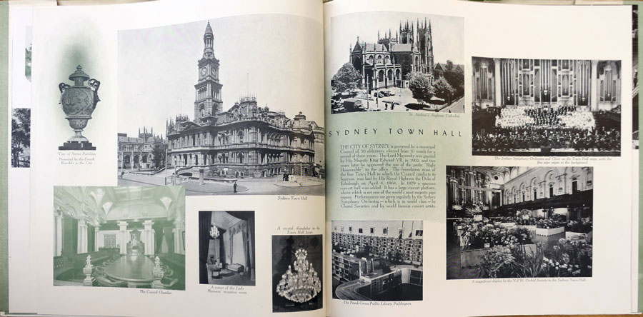
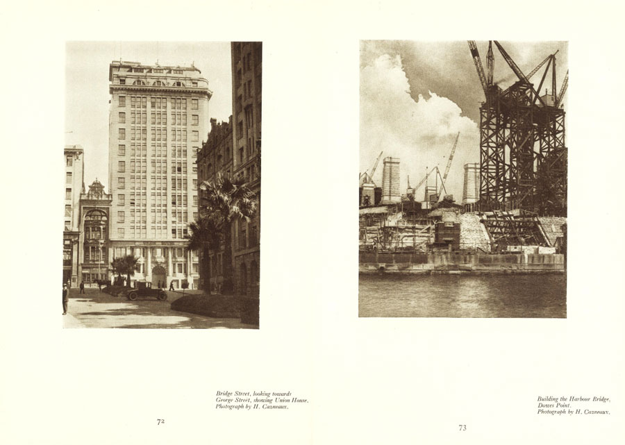
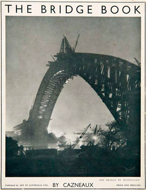
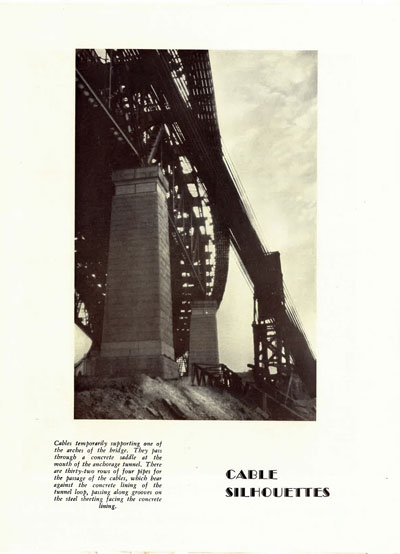
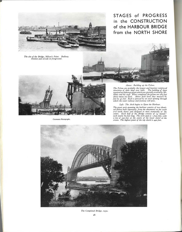
• photo-web • photography • australia • asia pacific • landscape • heritage •
• exhibitions • news • portraiture • biographies • urban • city • views • articles • • portfolios • history •
• contemporary • links • research • international • art • Paul Costigan • Gael Newton •