In The Spotlight contents page | Illustrations - photographs
essays: Gael Newton | Belinda Hungerford | Anne O'Hehir | Caroline McGregor
main Bruehl page
MAGIC IN MANHATTAN advertising campaigns Belinda Hungerford | 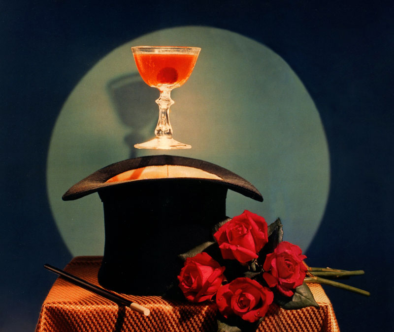 | The original essay was illustrated within the pages -
the plates for this essay are presented separately on the illustrations page In retelling how he made his start in advertising, Anton Bruehl claimed: I started near the top of the alphabet with Barton, Durstine & Osborne [sic]. All I had to show were pure pictorial photographs, yet the first art director who saw them handed me an advertising assignment. Before returning home, I showed the pictorials to an art director at J. Walter Thompson and he also gave me an assignment.1 Such a charmed and audacious entry was indicative of Bruehl's talent and ability to obtain advertising commissions with little prior experience. It also reflects the fortunate timing of his decision in mid 1926 to resign as an instructor at the Clarence H White School of Photography and enter the field of commercial photography. For in the mid 1920s, photography was beginning to overtake drawn illustration as the primary advertising tool. As a student of Clarence H White, whose school actively encouraged applying fine art photography principles to commercial art, Bruehl was perfectly positioned to negotiate a stellar profession in photographic advertising. It was also the influence of other White School alumni, specifically Paul Outerbridge and his famous Ide collar advertisement of 1922, which encouraged Bruehl to approach advertising agencies. Bruehl established himself quickly and became extremely successful in the advertising arena, amassing numerous Art Directors Club (ADC) awards and other accolades from 1927 on. He remained at the top of commercial illustration from the late 1920s to the 1960s, and his magazine work ranged from dramatic black-and-white compositions to his pioneering use of colour, from a modernist realism to a celebration of what we might now consider wonderfully kitsch tableaux. Among the most successful and innovative campaigns he worked on were for Weber and Heilbroner haberdashers in the late 1920s, Matson Line's Hawaiian cruises in the late 1930s, Four Roses whiskey in the 1940s and 1950s, and Dole pineapple of Hawaii in the 1950s. The campaigns were quite diverse, yet all were popular, long running and utilised Bruehl's skills in model and set making, and his ability to conjure products into characters and send them on adventures. The Fabric Group At the height of the roaring 1920s, Bruehl created the Fabric Group, a trio of cut-out paper dolls joined at the elbows, advertising readymade suits 'In the New York Manner’, available from the up-market Manhattan menswear chain Weber and Heilbroner. Originally conceived as black silhouette drawings designed by commercial artist Hans Schleger, alias Zero, the suggestion was later made to make the figures real and place them in photographic settings. Bruehl's fellow student from the White School, Ralph Steiner, was co-credited on the first four episodes and the captions were written by Silas Spitzer, who later became a food writer.2 But it was Bruehl who steered the campaign for the rest of its two-year lifetime. The Fabric Group campaign revealed Bruehl's creative signature style in its combination of imaginative, exquisitely crafted models and sets, artistry and humour. The Fabric Group campaign featured exclusively in The New Yorker magazine, first appearing in the 29 January 1927 issue. Appealing to a metropolitan audience, The New Yorker was originally aimed at the sophisticated and educated elite, however, in reality its readership broadened geographically and socially.3 Weber and Heilbroner were marketing their ready-made suits to establishment gents who were used to tailor-made clothes and night clubbing, as well as to aspiring young men wanting to join their ranks. New episodes of the campaign appeared weekly, and then fortnightly from February 1928. The Fabric Group chaps embarked on adventures in the Big Apple before venturing overseas in July 1927 to continue their escapades with a jaunty Joie de vivre. Travelling from New York to Paris, London, Venice, Turkey and Germany, Bruehl even included two Australian episodes, a nod to his country of birth. When up a tree, escaping from a curious giraffe, the chaps believe the creature 'merely wants to get a closer view of [their] Fabric Group suits!4 And in India, the trio were decorated with 'the Order of the Golden Melon Rind' because they promised to send the rajah a few Fabric Group suits.5 Upon their 'return' to New York in August 1928, the trio were greeted with a hero's welcome and the series continued in their home town. Bruehl's innovative advertising campaign kept readers enthralled with the trio's adventures, which always included a mention of their Fabric Group suits. Bruehl's skill in tabletop photography was put to great use in these advertisements; intricate positioning of the trio at the races, atop a windmill, on the Great Wall of China and even spying a dinosaur, created an advertising campaign that was fresh, intriguing and whimsical. The final, and eightieth advertisement ran on 29 December 1928 and featured the trio's farewell line: 'We hope you all get your heart's desire in 1929’. Interestingly, an actual suit is never shown in any of the advertisements. This reflects the trend in the 1920s of advertisers appealing to consumers' emotions and aspirations, rather than describing specific goods. Images and the accompanying copy began to revolve around luxury, comfort, social success, happiness, flirting and sentiment. Clothing in particular was promoted in terms of fashion and business success.6 Bruehl's dapper trio certainly exploited this new angle in advertising, as the Fabric Group men were cultured, financially successful, daring, popular with the ladies, constantly admired for their stylishness, and socialised in all the top nightspots. Bruehl's utilisation of bird's-eye perspective, dramatic light and shade, sharp angles, close-ups, repeated patterns, and illusionistic tableaux were modernist and consciously artistic devices that attracted advertisers and praise from peers.7 The format of the advertising campaign echoed the popularity of comics such as Katzenjammer Kids, Flapper Filosojy and Krazy Kat. As an image accompanied by dialogue in text, the advertisements in Breuhl's series leant themselves to being read as a cohesive narrative. They are also reminiscent of silent films, with the captions standing in for intertitles. Conversely, the series seemed to anticipate films yet to come, featuring the now well-known 'man about town' character, dressed in his dapper suit and hat, and played by actors such as William Powell. The Fabric Group trio campaign ceased at the end of 1928 without explanation. Bruehl continued to provide advertising images for Weber and Heilbroner until 15 June 1929, with essentially the same message: with good clothes, upwardly mobile young men could cope with whatever life threw their way. Copy became a narrative accompanied by a range of Bruehl images, some of which were taken from other commissions, such as the smoke stacks originally taken for Clyde-Mallory shipping line, which won an ADC award in 1930. A striking, modernist image of silk top hats, which ran on 13 April 1929, won Weber and Heilbroner, Bruehl and Spritzer a Harvard Advertising Bok Award in 1929 and became one of Bruehl's best-known images. The series garnered wide attention from the public and the advertising industry for its application of modern design and dramatisation of products, with the campaign being awarded the ADC Photographs Medal for 1928, and another ADC award for typography (shared with Silas Spitzer) in 1929. Bruehl's Weber and Heilbroner images in The New Yorker ceased some months before the stock market crash of October 1929, which caused company failures and a massive downturn in advertising for the next five years.8 Despite the Depression, elite commercial work still came Bruehl's way, including a major commission for the Cadillac V-16 engine in 1930 and work for Vanity Fair, which included his pioneering colour work with Fernand Bourges. Hawaii Travelling, which featured so prominently in the Fabric Group campaign, was a theme that would recur in Bruehl's advertising work. Cruising to Hawaii from San Francisco and Los Angeles grew in popularity from the mid 1920s, and Matson Line was the major company accommodating the demand. Matson Line advertisements in the mid 1930s concentrated on shipboard pleasures as much as location.9 Name photographers were recruited in the late 1930s to glamorise the voyage, the destination and the colourful natives. When Bruehl photographed a series of colour advertisements for the company, he featured beautiful women as tourists onboard the ship, ashore and on surfboards, as well as local wahines. While all of images were made in the New York studio, Bruehl created a vibrant illusion of tropical outdoor life.10 In 1940-41 Edward Steichen also did a campaign for Matson Line but focused on location shots and the exoticism of Hawaii as a destination.11 A decade later, in the 1950s, Bruehl would return to Hawaii for another campaign, this time for the Hawaiian Pineapple Company, promoting Dole tinned pineapple and juice. In 1952, Bruehl was commissioned by Dole to photograph ten shots on location that depicted 'true Hawaii’. They were to be used as background for images of Dole pineapple products, which would later be shot in the studio. The assignment initially appeared straightforward, but the reality proved to be more complicated. The shoot required long searches to locate the perfect coconut palm which, once found, needed perfect coconuts to be hauled up and attached. It required outrigger canoes, which could only be found in one place, and difficulties were posed when Ending someone to make authentic 'ti leaf’ grass skirts. To top it off, torrential rain started after setting up to shoot a luau scene. New equipment and specially ground lenses were also required on location as well as in the studio. Once back on the mainland, the studio work began in which the background image was combined with the props and the product. The backgrounds were projected from the rear onto a translucent screen, in front of which the still-life elements were arranged. The screen image was photographed first, with the entire studio lights turned off so that the still-life components acted as a mask. Then, by draping the screen with black velvet and lighting the still life, a second exposure completed the composite photograph.12 Compositions of the foreground elements were originally studied on location and then flowers, fruit and other props were flown from Hawaii to Bruehl in his studio in New York for photographing. Pineapples proved especially problematic, as the ones that looked appealingly ripe did not have attractive foliage. So the foliage of unripe pineapples was combined with the bodies of the ripe. Bruehl's determination and knack for creating complex advertising illustrations and overcoming any difficulties that arose drew upon his background in engineering and was complemented by a great imagination. The Dole campaign was unusual for Bruehl in one particular regard: location shooting. Bruehl was most comfortable in his studio, where he could control conditions. The idea to shoot on location in Hawaii most likely came from the advertising agency, influenced by the popularity of dynamic photojournalism and reportage using flash equipment to capture everyday life in picture magazines like Life. For the audience, the resulting hybrid of location and studio images of Hawaii vividly connected the consumer of an everyday tinned food with its exotic, tropical origin. Four Roses The fascination Bruehl had with model making in advertising continued throughout his career and found full expression in a colour campaign that began in the late 1930s for Frankfort Distilleries Company's Four Roses whiskey. Bruehl's ingenuity in making sets was such that the company's advertisement in Life magazine on 16 January 1939 showed the photographer himself at work. It featured Bruehl working on the lighting for one of the company's standard images depicting their target demographic of clubmen, staid businessmen and older statesmen. When creating such complex tableaux, Bruehl was often faced with technical difficulties that needed to be resolved. In one instance, on a hot summer's day, Henry Lent of Young & Rubicam came up with the concept of four roses frozen in a block of ice. When it came to creating the prop, the completely frozen ice squashed the roses. However, Bruehl discovered that they would stay intact when the centre of the ice remained unfrozen. The resulting advertisement of 1940 ran every summer for years.13 A winter counterpart, with a life-size snowman holding an Old Fashioned, appeared in Life magazine on 28 December 1942, followed by a hot toddy in a real mailbox on 25 January 1943. From 19 April 1943 Bruehl photographed a campaign of ‘model ads,' many capitalising on the company's rose trademark by placing four actual roses in miniature settings.14 Selecting the roses for each advertisement was a considered affair; rumours abound of choosing between 50 and 300 blooms each time. Petals were sometimes taken from one rose to be attached to another and wired into place. Leaves were positioned and reinforced with tape, and glycerin dewdrops were selectively applied by Bruehl. The model props were then scaled to the size of the roses. Bruehl not only took the photographs but made the original cardboard model from which the model maker, Willi Noell, worked. Noell was a long-time collaborator of Bruehl's, having made models for him since 1929. Many defied logic as to how they were made, including the Manhattan magic of 1948, which had a glass floating in the air. The cost of the props was often exorbitant—one example from around 1945 was the model baby grand piano that cost more than a real one.15 Some fifty Four Roses campaign images by Bruehl appeared in Life, Look, Collier's Weekly, Ebony, Time and The New Yorker from 1942 until 1953. The campaign was revived in 1956-58 due to popular demand from consumers and retailers, who appreciated the cleverness of the original series. An image of a hot toddy on a fuel stove earned Bruehl, art director Walter Glenn and Young & Rubicam an ADC award in 1951. Over half a century later, the adventures of Bruehl's 'Four Roses' still amuse and engage the viewer. Their almost abstract design and colour is striking in comparison to the brand's conventional parallel production of elite 'club' men narratives until the swinging 1960s brought a new dynamism and youthful pitch to fashion and product advertising. In the latter period of Bruehl's photographic career, food photography for magazines like McCall’s Magazine became a major stream of his studio's output. The work suited Bruehl's skills and his playful imagination, which could transform even vegetables into characters, as in his 1960 Birds Eye Foods tableaux, which fifty years later still brings delight. Bruehl's product advertising photography was the constant in his career, and in his work the ingenuity and skill of a dedicated artist and technician is evident. This body of work also reveals him as a photo magician who retained a childlike delight in a toy land of his own creation. the plates for this essay are presented separately on the illustrations page
Notes - A Bruehl (as told to Mildred Stagg), in M Stagg, ‘I was an amateur! Popular Photography, January 1958, p 127. Barton, Durstine & Osborn, on Madison Avenue, was founded in 1923. By 'pictorials’ Bruehl implies that he had only his art photographs to show but he had works in the 'Advertising and commercial section' of the Exhibition of photographs by students and alumni of the Clarence H White School of Photography at The Art Center in March 1925.
- A Steiner-Bruehl advertisement for Weber and Heilbroner socks appeared in The New Yorker on 1 January 1927 and had a similar jaunty text.
- G H Douglas, The smart magazines: 50 years of literary revelry and high jinks at Vanity Fair. The New Yorker, Life, Esquire and The Smart Set, Archon Books, Hamden, 1991, pp 1,139.
- 'The Fabric Group abroad no 27! The New Yorker, 31 December 1927, p 45.
- 'The Fabric Group abroad no 26! The New Yorker, 7 January 1928, p 61.
- Editors of Printers' Ink, PrintersInk: fifty years 1888-1938 (reissue of Printers' Ink: A journal for Advertisers, vol. 184, no. 4,28 July 1938), Garland Publishing, New York, 1968, p 362.
- M H Bogart. Artists, advertising and the borders of art. University of Chicago Press, Chicago, 1995, pl90.
- Page from Printers' Ink, Advertising: today, yesterday, tomorrow: an omnibus of advertising, McGraw Hill, New York, 1963, p 90; National Gallery of Australia Research Library, Anton Bruehl Papers [NGARL-MS36].
- P Johnston, Real fantasies: Edward Steichen's advertising photography, University of California Press, Berkeley, 1997, p 249.
- Bruehl was awarded an ADC Distinctive Merit for Photographic Illustrations in Class Magazines for the Matson Line campaign.
- Johnston, p 249.
- A Bruehl, ‘The Dole photographs! excerpt from unknown and undated magazine c 1953; National Gallery of Australia Research Library, Anton Bruehl Papers [NGARL-MS36].
- S Fox, The mirror makers: a history of American advertising and its creators, William Morrow and Company, New York, 1984, p 140. The iceblock image appeared in Life, 29 July 1940, p 30; Life, 5 August 1946, p 38; and Life, 30 June 1961. p 14. Brueh’s distinctive' model' images for the company appear to finish around 1958.
- Legend has it that the founder of Four Roses was smitten with a Southern belle. When he proposed to her, he requested that if her answer was 'yes' she wear a corsage of roses to the upcoming ball. Happily, the answer was in the affirmative and the whiskey was named Four Roses as a symbol of his passion. Frankfort Distilleries Company was bought out by Seagrams in 1943 and Four Roses brand was being repositioned as a top-quality product.
- Unknown author.' How to make a model ad’, Printers' Ink, [undated] 1956, pp 24-32. The details of two campaigns are given. The original Bruehl Four Roses snowman and versions of the roses in ice reappeared in Life, 19 November 1956, p 54.
In The Spotlight contents page | Illustrations - photographs essays: Gael Newton | Belinda Hungerford | Anne O'Hehir | Caroline McGregor main Bruehl page |